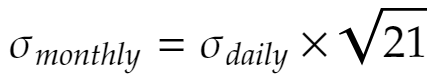
The standard rule for calculating a stock returns monthly volatility is to multiply the daily volatility by the square root of the number of business days in that month, for instance:
This rule is derived from an independent log-normal daily returns model. However, if the stochastic process is considered autoregressive, i.e, having its output variable linearly dependent on its own previous values, then this rule is likely to give us inaccurate volatilities.
Autoregressive behaviour can express itself as a “momentum”, perpetuating the effect of an upward or downward movement, or as a “reversal”, acting against it. The first case can lead to a higher volatility than that calculated by the standard rule, and the later case can lead to a lower volatility.
In this post I evaluate if an autoregressive Gaussian model better describes the behavior of observed daily stock returns, when compared to a non autogressive control model.
The code I share in this article is written in the R programming language, using the following packages: plotly, ggplot2, sfsmisc.
Data Set
Just like in the previous article, I picked three years worth of PETR4 historical log returns to work on, which is the most actively traded stock in B3, the largest stock exchange in Brazil. You can find the source data in the links below:
To generate these files I used a simple parser I built for B3 historical quotes, freely available at their website from 1986 up to the current year, which you can find here.
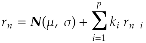
The Autoregressive (AR) Model
Our AR model is defined as:
Where:
- μ → is the Gaussian distribution mean
- σ → is the Gaussian distribution standard deviation
- ki → is the AR parameter of order “i”
- p → is the AR model order
Let’s take a moment to analyze it. It is composed of two terms, a stochastic term and an AR term. If p, the model order, is zero, than it becomes a simple non autoregressive Gaussian model, similar to the one I used in my previous post. If p is greater than zero than past outputs are taken into account when calculating its current output, weighted by the ki parameters.
Model Fitting
Since my last post I have sharpened my R skills a bit 🤓, and learned how to use optimization functions for fitting parameters more efficiently (instead of using a brute-force approach). First let me define the autoregressive model likelihood function that will be minimized:
# calculates likelihood for the AR model, and inverts its signal
# k: model parameters ([σ, μ, kp, kp-1, ... , k1 ])
# x: stock returns samples
likelihood <- function(k, x) {
  lke <- 0
  offset <- 21
  order <- length(k) - 2
  for(i in offset:length(x)) {
    xt <- x[i]
    if (order > 0) {
      xt <- xt - sum(k[3:length(k)] * x[(i-order):(i-1)])
    }
    p <- dnorm(xt, sd=k[1], mean=k[2])
    lke <- lke + log(p)
  }
  return (-lke)
}
Now let’s read the data set and optimize our model’s parameters for varying p orders, starting at zero (non autoregressive control case) up to a twenty days regression:
x <- read.table("PETR4_2019.txt")[["V1"]]

max_order <- 20

res <- lapply(0:max_order, function(n) {
  return (optim(c(0.01, 0.0, rep(-0.01, n)), function(k) likelihood(k, x), method="BFGS"))
})
The resulting res list will hold, for each model order analyzed, the optimized parameter set and its corresponding likelihood. Let’s check the results, below is the code for plotting the likelihood of each model order analyzed, which will help us find the best performing one:
df <- data.frame(
  x = seq(0, max_order), y = sapply(res, function(e) (res[[1]][[2]]-e[[2]]))
)

p <- ggplot() +
  ggtitle("Order Analysis") +
  xlab("Order (p)") +
  ylab("Log-likelihood ratio") +
  geom_line(data = df, aes(x=x, y=y), color='red')
ggplotly(p)
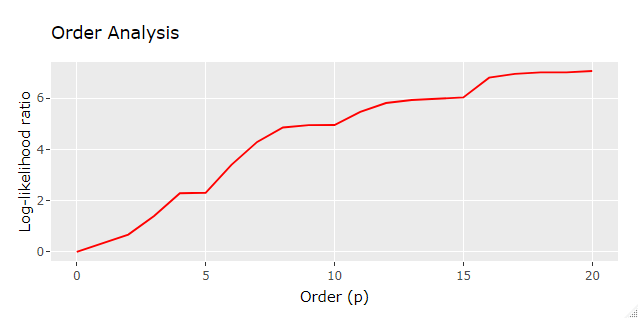
Interestingly enough it seems that AR models of higher orders yielded much higher likelihood than lower orders, possibly indicating that stock daily returns is under the influence of an AR effect, but let’s not jump into any conclusion just yet!
So the best performing model was found to have p=20, log-likelihood ratio of 7.0685184 and the following set of parameters:
- σ → 0.0178999192
- μ → 0.0010709814
- [kp, kp-1, … , k1] → [-0.0210373765, 0.0038455320, -0.0233608796, 0.0329653224, -0.0824597966, 0.0177617412, 0.0142196315, 0.0313809394, 0.0519001996, -0.0562944497, 0.0034231849, 0.0255535975, 0.0824235508, -0.0832489175, -0.0863261198, -0.0008716017, -0.0996273827, -0.0920698729, -0.0613492897, -0.0640396245]
Which raises the question:
Is this result statistically significant to confirm an AR effect in the analyzed data?
Well, we will find that out in the next section.
Probability Value
In statistical hypothesis testing, the probability value or p-value is the probability of obtaining test results at least as extreme as the results actually observed during the test, assuming, in our case, that there is no autoregressive effect in place. If the p-value is low enough, we can determine, with resonable confidence, that the non autoregressive model hypothesis, as it stands, is false.
In order to calculate the p-value initially we need to estimate the observed log-likelihood ratio probability distribution under the hypothesis that our process follows a non autoregressive Gaussian model (control process). So let’s replicate the analysis above under this assumption:
iterations <- 1000   # number of analysis per order
max_order <- 20      # same number of orders as before
num_samples <- 247   # replicating observed data length (1 year)
wiener_std <- 0.018  # Control model standard deviation

res <- lapply(1:iterations, function(z) {

  # generates independent normally distributed samples
  x <- rnorm(num_samples, 0, wiener_std)

  y <- lapply(0:max_order, function(n) {
    return (optim(c(0.01, 0.0, rep(-0.01, n)), function(k) likelihood(k, x), method="BFGS"))
  })

  return (sapply(y, function(e) c(-e[[2]], e[[4]])))
})
Beware that this code may take a couple of hours to complete running, or more, dependeding on your notebook configuration. It generates 1000 log-likelihood ratio samples for each model order. The box plot below gives us a qualitative understanding of this output:
df <- lapply(0:max_order, function(k) {
  vec <- t(sapply(1:length(res), function(l) {
    return (c(k, res[[l]][1, k + 1] - res[[l]][1, 1]))
  }))
  return (data.frame(
    period = vec[,1],
    ratio = vec[,2]
  ))
})

df <- do.call(rbind, df)
df$period <- as.factor(df$period)

ggplot(df, aes(x=period, y=ratio)) +
  ggtitle("Control process analysis") +
  xlab("Order (p)") +
  ylab("Log-likelihood ratio") +
  geom_boxplot()
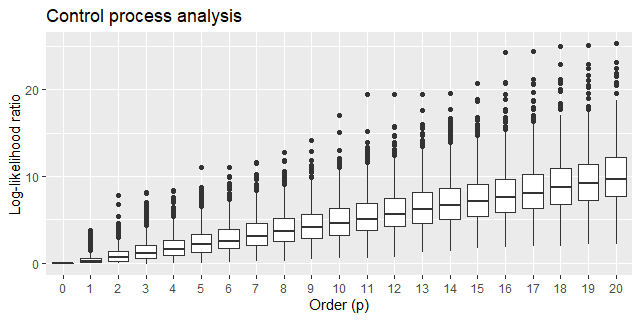
This result took me by surprise. As the order of the AR model grows, the better it becomes in fitting samples generated by a non AR model! It sure looks counterintuitive at first, but after a second thought it’s not that surprising at all, since as we add more parameters to the AR model we are actually making it easier for it to mimic this set of generated samples.
Moving forward, I defined a function that calculates the one-tailed p-value from this resulting res list. A margin of error of 3% (95% confidence interval) is expected since 1000 samples were used:
# caluates the one-tailed p-value
# res: pre-processed log-likelihood ratioss
# n: the model order
# lke: log-likelihood ratio whose p-value should be obtained

p_value <- function (res, n, lke) {
  vec <- sapply(1:length(res), function(l){
       return (res[[l]][1, n + 1] - res[[l]][1, 1])
  })
  d_lke <- density(vec)
  i <- findInterval(lke, d_lke[["x"]])
  l <- length(d_lke[["x"]])
  if (i == l) {
    return (0.00)
  }
  return (integrate.xy(d_lke[["x"]][i:l], d_lke[["y"]][i:l]))
}
Thus, calling this function like so p_value(res, 20, 7.0685184) for our original “best fit” yields a p-value of 0.814. This figure is nowhere near the typical 0.05 threshold required for rejecting the non AR model hypothesis.
Also notice that the log-likelihood ratio alone is not sufficient for determining the AR model order that best outperforms the control model, as we need to look at the p-value instead. I ran the analysis for the previous years as well and the complete p-value results (2017, 2018, 2019) are displayed below:
| Order (p) | 2017 | 2018 | 2019 |
|---|---|---|---|
| 1 | 0.000 | 0.069 | 0.399 |
| 2 | 0.002 | 0.195 | 0.502 |
| 3 | 0.005 | 0.005 | 0.420 |
| 4 | 0.000 | 0.011 | 0.336 |
| 5 | 0.001 | 0.000 | 0.465 |
| 6 | 0.001 | 0.000 | 0.338 |
| 7 | 0.003 | 0.000 | 0.295 |
| 8 | 0.005 | 0.000 | 0.296 |
| 9 | 0.008 | 0.001 | 0.360 |
| 10 | 0.014 | 0.002 | 0.452 |
| 11 | 0.011 | 0.001 | 0.456 |
| 12 | 0.019 | 0.001 | 0.479 |
| 13 | 0.024 | 0.002 | 0.540 |
| 14 | 0.028 | 0.001 | 0.614 |
| 15 | 0.043 | 0.002 | 0.661 |
| 16 | 0.014 | 0.003 | 0.617 |
| 17 | 0.013 | 0.004 | 0.670 |
| 18 | 0.011 | 0.005 | 0.725 |
| 19 | 0.016 | 0.005 | 0.775 |
| 20 | 0.007 | 0.005 | 0.814 |
Despite of the weak results for 2019, after taking the margin of error into account 17 out of 20 model orders passed the significance test for the year of 2017 and 18 out of 20 model orders passed the significance test for the year of 2018.
Conclusion
I’ve got mixed results in this analysis. If I were to look to the stock’s daily returns in the year of 2019 alone I might conclude that the control model hypothesis couldn’t be rejected in favor of the AR model. However, the results for the years of 2017 and 2018 seem strong enough to conclude otherwise. This may indicate an intermittent characteristic of the AR behavior intensity. Further investigation is required.