I’m a stock market enthusiast 📈, so lately I have spent my spare time on the topic of stock option pricing, and I was curious to find out whether or not I could build a script that accurately reflected real market option prices. It turns out I came close, and learned a lot along the way, which I share in this article.
My analysis uses the Monte Carlo method for pricing options, which from all available pricing models in the literature is the most straight forward, practical one for a software developer to start working with, when compared to closed form, analytic models, such as the Black–Scholes model.
The code I share in this article is written in the R programming language, using the following packages: sfsmisc, plotly, ggplot2.
Data Set
I had to pick a stock to work on as the starting point, so I decided to use PETR4 which is the most actively traded stock in B3, the largest stock exchange in Brazil, and also the stock with the most actively traded options.
On December 17, 2019, while PETR4 was priced at R$ 29.71, I spoted the following european call option prices:
| Symbol | Strike | Bid | Ask |
|---|---|---|---|
| PETRA232 | 22.81 | 6.92 | 7.09 |
| PETRA239 | 23.81 | 5.93 | 6.09 |
| PETRA252 | 24.81 | 4.98 | 5.09 |
| PETRA257 | 25.31 | 4.48 | 4.64 |
| PETRA261 | 25.81 | 4.01 | 4.15 |
| PETRA266 | 26.31 | 3.57 | 3.68 |
| PETRA271 | 26.81 | 3.12 | 3.22 |
| PETRA277 | 27.31 | 2.67 | 2.76 |
| PETRA281 | 27.81 | 2.24 | 2.33 |
| PETRA285 | 28.31 | 1.88 | 1.90 |
| PETRA289 | 28.81 | 1.52 | 1.54 |
| PETRA296 | 29.31 | 1.19 | 1.21 |
| PETRA301 | 29.81 | 0.92 | 0.93 |
| PETRA307 | 30.31 | 0.69 | 0.71 |
| PETRA311 | 30.81 | 0.52 | 0.53 |
| PETRA317 | 31.31 | 0.38 | 0.39 |
| PETRA325 | 32.31 | 0.20 | 0.22 |
| PETRA329 | 32.81 | 0.16 | 0.17 |
| PETRA333 | 33.31 | 0.12 | 0.13 |
| PETRA342 | 33.81 | 0.10 | 0.11 |
| PETRA343 | 34.31 | 0.07 | 0.09 |
| PETRA351 | 34.81 | 0.06 | 0.07 |
| PETRA358 | 35.81 | 0.04 | 0.05 |
| PETRA363 | 36.31 | 0.03 | 0.04 |
| PETRA368 | 36.81 | 0.02 | 0.04 |
| PETRA373 | 37.31 | 0.02 | 0.03 |
| PETRA378 | 37.81 | 0.02 | 0.03 |
| PETRA383 | 38.31 | 0.01 | 0.02 |
| PETRA388 | 38.81 | 0.01 | 0.02 |
| PETRA393 | 39.31 | 0.01 | 0.02 |
| PETRA398 | 39.81 | 0.01 | 0.02 |
The maturity of these options is the same, January 20, 2020, i.e., 20 business days from the recorded prices date. I saved this data into a CSV formatted file that you can find here.
Besides that I also used six months worth of daily PETR4 log returns from 17/Jun/2019 to 16/Dec/2019 (126 samples), which you can find here.
Distribution of Stock Returns
Under the Monte Carlo method, in order to calculate the price of a stock option, first we need a probability distribution model of the stock returns. Let’s take a look at the probability density estimate for our stock:
x <- read.table("PETR4_Returns.txt")[["V1"]]

d_real <- density(x)
df <- data.frame(x = d_real[["x"]], y = d_real[["y"]])

p <- ggplot() +
  ggtitle("PETR4 daily returns density estimate") +
  geom_line(data = df, aes(x=x, y=y), colour="black")
ggplotly(p)
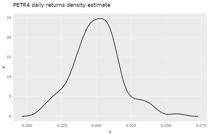
Because the number of samples is small, we don’t get that fine-looking symmetric density estimate we would like. Instead, what we get is a density estimate somewhat sensitive to trends and macroeconomical events of this six month period. If we were to look at the previous six month period this observed density estimate would certainly show differences.
The next step is to find a model that reasonably fits this observed density. While there isn’t an agreement on which probability density function best describes stock returns, I decided to turn to two notable, widely adopted, basic functions, the Gaussian distribution and the Cauchy Distribution.
Guassian Model
Let’s try to fit a Gaussian density function to our market data, and see what it looks like. First I will define a couple of auxiliary functions:
# generates a truncated gaussian density
dgauss <- function(std, mean, min, max) {
  d.x <- (0:511) * (max - min) / 511 + min
  d.y <- dnorm(d.x, mean, sd = std)
  d.y <- d.y / integrate.xy(d.x, d.y)
  f <- data.frame(x = d.x, y = d.y)
  return (f)
}

# interpolates data frame
interpolate <- function(df, min, max, n) {
  step <- (max - min) / n
  pol <- data.frame(
    with(df,
         approx(x, y, xout = seq(min, max, by = step))
    )
  )
  return (pol)
}

# simple numeric maximum likelihood estimation
# (resolution reffers to that of daily log returns)
mle <- function(dist, x) {
  min_x <- min(x)
  max_x <- max(x)
  resolution <- 10000
  n = (max_x - min_x) * resolution
  rev <- interpolate(data.frame(x = dist$x, y = dist$y), min_x, max_x, n)
  indexes = sapply(x, function (x) { return ((x - min_x) * resolution + 1) })
  return (log(prod(rev$y[indexes])))
}
With these functions I developed a simple brute force script to find the Gaussian distribution standard deviation that best fits the observed density estimate:
max_mle <- -Inf
d_norm <- c()

for(k in seq(0.001, 0.1, by = 0.0001)) {
  dist <- dgauss(k, mean(x), -6 * sd(x), 6 * sd(x))
  val <- mle(dist, x)
  if (val > max_mle) {
    d_norm <- dist
    max_mle <- val
  }
}

df1 <- data.frame(x = d_real[["x"]], y = d_real[["y"]])
df2 <- data.frame(x = d_norm[["x"]], y = d_norm[["y"]])

p <- ggplot() +
  ggtitle("Probability densities") +
  scale_colour_manual("", values = c("red", "blue")) +
  geom_line(data = df1, aes(x=x, y=y, colour="Observed")) +
  geom_line(data = df2, aes(x=x, y=y, colour="Gaussian"))
ggplotly(p)
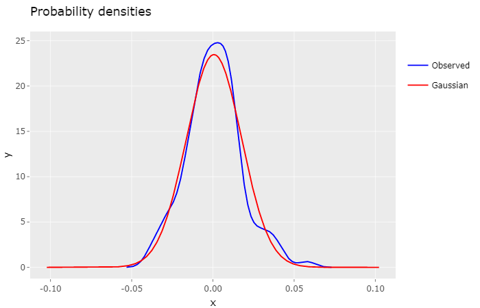
Both densities display a similar shape, but it’s perceptible that the Gaussian density decreases marginally faster than the observed density.
Despite the fact that the Gaussian distribution is widely used in fianacial models, it has some well known pitfalls, namely its inability to encompass fat tails observed in historical market data. As a result it will fail accurately describe extreme volatility events, which can lead to possibly underpriced options.
Cauchy Model
The Cauchy distribution, just like the Gaussian distribution, is a stable distribution, but one with fat tails. Over the years several academic papers have looked into it as an alternative to best describe these extreme volatility events.
So let’s see how it performs. Initially, I defined the following auxiliary function in order to fit it to the observed density.
# generates a truncated cauchy density
dcauchy <- function(s, t, min, max) {
  d.x <- (0:511) * (max - min) / 511 + min
  d.y <- 1 / (s * pi * (1 + ((d.x - t) / s) ^ 2))
  d.y <- d.y / integrate.xy(d.x, d.y)
  f <- data.frame(x = d.x, y = d.y)
  return (f)
}
The brute force fitting script is the same as the previous one, replacing the call to dgauss with dcauchy:
max_mle <- -Inf
d_cauchy <- c()

for(k in seq(0.001, 0.1, by = 0.0001)) {
  dist <- dcauchy(k * (sqrt(2/pi)), mean(x), -6*sd(x), 6*sd(x))
  val <- mle(dist, x)
  if (val > max_mle) {
    d_cauchy <- dist
    max_mle <- val
  }
}

df1 <- data.frame(x = d_real[["x"]], y = d_real[["y"]])
df2 <- data.frame(x = d_cauchy[["x"]], y = d_cauchy[["y"]])

p <- ggplot() +
  ggtitle("Probability densities") +
  scale_colour_manual("", values = c("red", "blue")) +
  geom_line(data = df1, aes(x=x, y=y, colour="Observed")) +
  geom_line(data = df2, aes(x=x, y=y, colour="Cauchy"))
ggplotly(p)
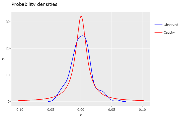
Intuitively, by looking at this plot, it feels that the Cauchy density isn’t as much as a good fit as the Gaussian density. Indeed, the log-likelihood ratio of the Gaussian Model to the Cauchy Model is 7.5107, quite significant.
The general consensus for the Cauchy distribution is that it has too fat tails, which in our case may lead to overpriced options. Nevertheless, it can be very useful for defining a high volatility scenario for risk analysis.
Now that we have our probability distribution models we can go ahead and calculate option prices based on them.
Option Pricing
The technique applied to calculate the fair price of an option under the Monte Carlo method is:
(1) to generate a large number of possible, but random, price paths for the underlying stock via simulation, and (2) to then calculate the associated exercise value (i.e. “payoff”) of the option for each path. (3) These payoffs are then averaged and (4) discounted to today. This result is the value of the option.1
To accomplish that I defined, yet again, more auxiliary functions:
# generates random samples for a probability density
dist_samples <- function(dist, n) {
  samples <- (approx(
    cumsum(dist$y)/sum(dist$y),
    dist$x,
    runif(n)
  )$y)
  samples[is.na(samples)] <- dist$x[1]
  return (samples)
}

# calculates the expected value of a probability density
exp_val <- function(dist) {
  v <- dist[["x"]] * dist[["y"]]
  return (sum(v) / sum(dist[["y"]]))
}

# converts a single day probability density to a n-day period
# (removes any drift from the input density)
dist_convert <- function(dist, n) {
  dd <- data.frame(x = dist$x - exp_val(dist), y = dist$y)
  dn <- density(sapply(1:100000, function(x) (sum(dist_samples(dd, n)))))
  return (dn)
}

# calculates the price of a call option from a probability density
call_price <- function(dist, strike, quote) {
  v <- (((exp(1) ^ dist[["x"]]) * quote) - strike) * dist[["y"]]
  v <- pmax(v, 0)
  return (sum(v) / sum(dist[["y"]]))
}
And here’s the final script for calculating option prices based on the fitted Gaussian and Cauchy distribution, for each strike price, and then plot the result against actual (Bid) prices:
stock_quote <- 29.71
days_to_maturity <- 20

df1 <- read.csv("PETR4_Calls.txt", header = TRUE, sep = ";")
strikes <- df1[["Strike"]]

dn <- dist_convert(d_norm, days_to_maturity)
y2 <- sapply(strikes, function(x) call_price(dn, x, stock_quote))
df2 <- data.frame(x = strikes, y = y2)

dn <- dist_convert(d_cauchy, days_to_maturity)
y3 <- sapply(strikes, function(x) call_price(dn, x, stock_quote))
df3 <- data.frame(x = strikes, y = y3)

p <- ggplot() +
  ggtitle("Option Prices") +
  xlab("Strike Price") +
  ylab("Option Price") +
  scale_colour_manual("", values = c( "black", "red", "blue")) +
  geom_line(data = df1, aes(x=Strike, y=Bid, colour="Actual")) +
  geom_line(data = df2, aes(x=x, y=y, colour="Gaussian")) +
  geom_line(data = df3, aes(x=x, y=y, colour="Cauchy"))
ggplotly(p)
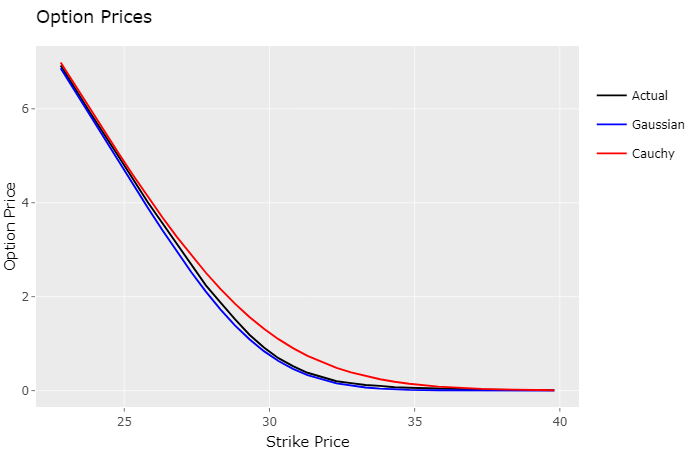
As speculated, actual market prices are slightly above the Gaussian model prices (underpriced), and below the Cauchy model prices (overpriced). The Gaussian model came really close to the actual option prices, which makes sense, since it’s likelihhod to the observed density was much higher.
So after analysing this plot I had an idea, since this final script can take any probability density to calculate option prices, what if I used the observed density estimate instead, would it yield better, more accurate option prices?
stock_quote <- 29.71
days_to_maturity <- 20

df1 <- read.csv("PETR4_Calls.txt", header = TRUE, sep = ";")
strikes <- df1[["Strike"]]

dn <- dist_convert(d_real, days_to_maturity)
y2 <- sapply(strikes, function(x) call_price(dn, x, stock_quote))
df2 <- data.frame(x = strikes, y = y2)

p <- ggplot() +
  ggtitle("Option Prices") +
  xlab("Strike Price") +
  ylab("Option Price") +
  scale_colour_manual("", values = c( "black", "red")) +
  geom_line(data = df1, aes(x=Strike, y=Bid, colour="Actual")) +
  geom_line(data = df2, aes(x=x, y=y, colour="Empirical"))
ggplotly(p)
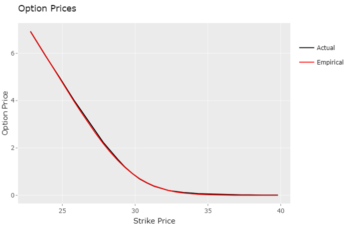
In fact, to my surprise, it did. Visually the lines appear to be on top of each other. The table below displays the standard deviation from the models estimates to the actual market prices:
| Model | σ |
|---|---|
| Gaussian | 0.0463 |
| Cauchy | 0.1369 |
| Empirical | 0.0290 |
Conclusion
The “empirical” model turned out to be the one that best approximates market prices, for this particular stock (PETR4) in the B3 stock exchange. Market option prices are determined by automated trading systems, usually employing much more sophisticated techniques than the one presented here, in real-time, almost instantaneously reflecting price shifts of the underlying stock. Even so, this simplified approach yielded great results, worth exploring more deeply.
Notes
- I submitted this article on Hacker News and it received a lot of attention there. One comment correctly pointed out that the standard technique for fitting probability distributions is to use maximum likelihood estimation (MLE), instead of the least squares regression approach that I originally employed. So I ran the analysis again using MLE, observed improved results for both models, and updated the code and plots.
- I also fixed a minor issue in the function that generates random samples for probability densities, and recalculated the “empirical” model standard deviation.
- For reference you can find the original article here.
Sources
[1] Don Chance: Teaching Note 96-03: Monte Carlo Simulation